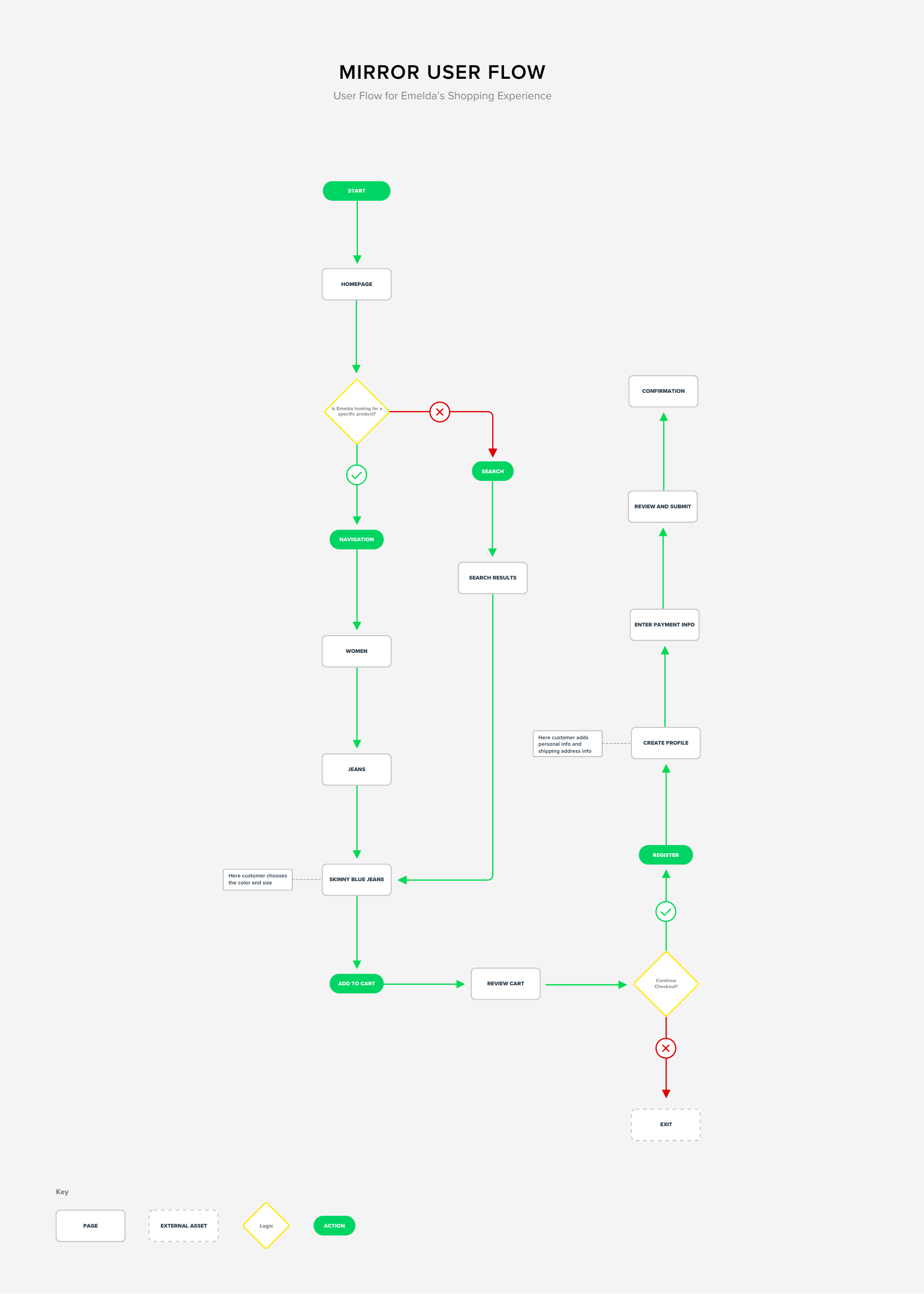
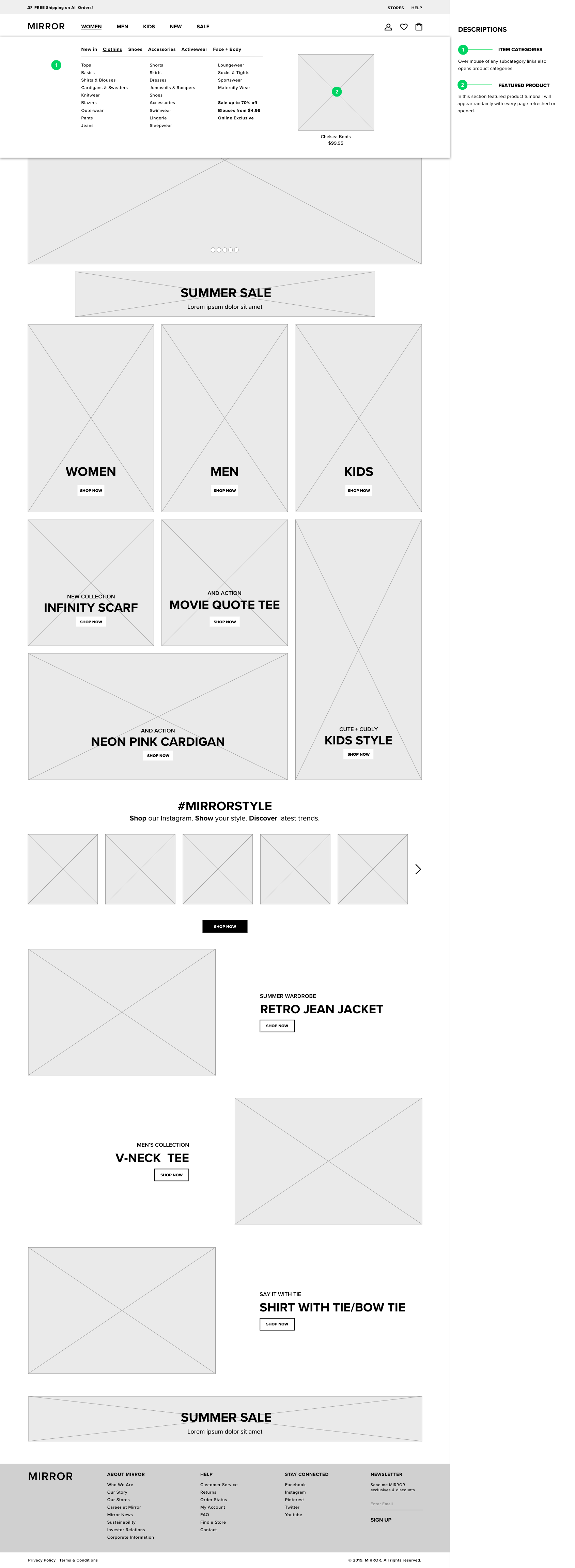
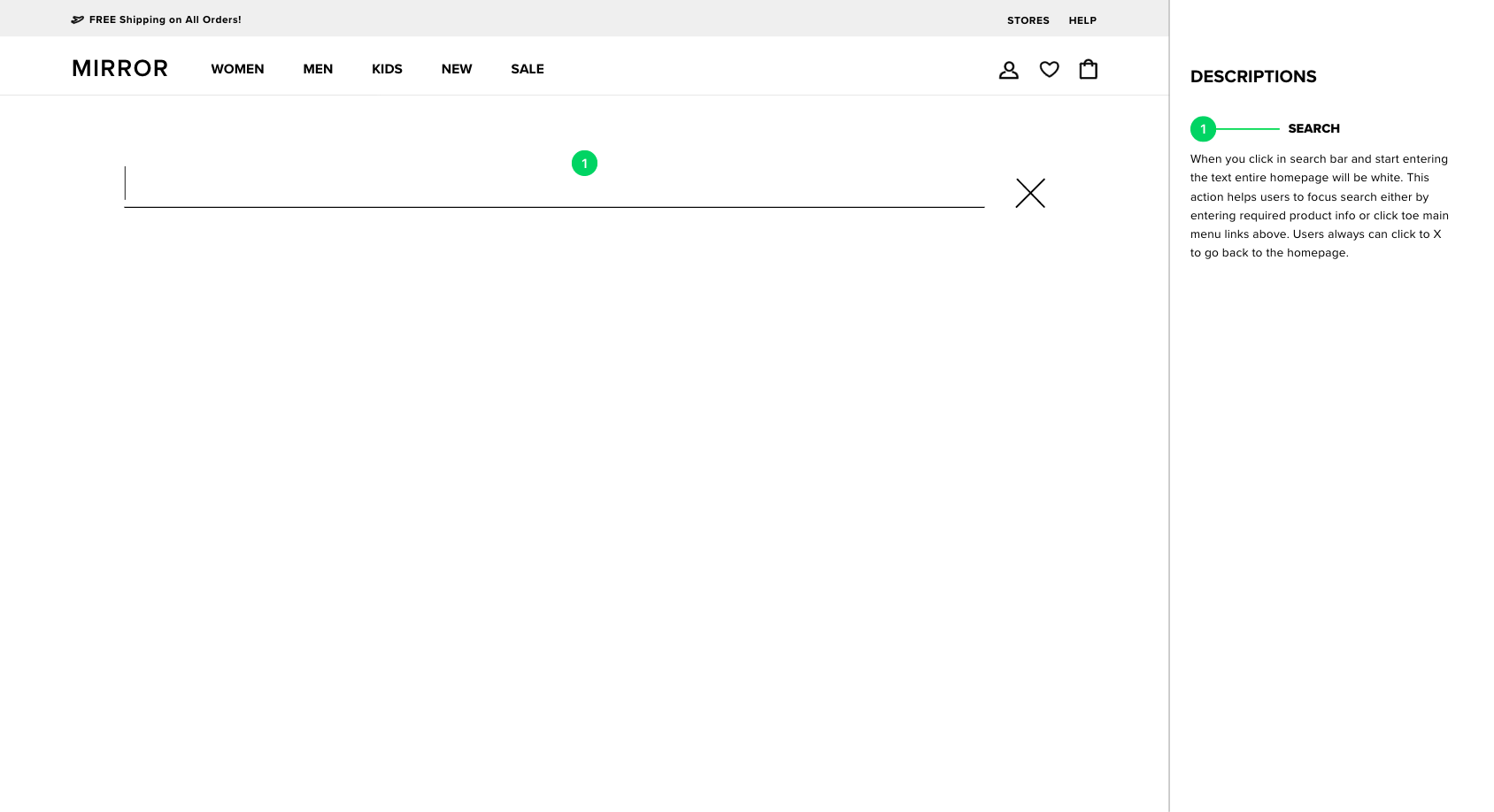
Mirror

Transforming a brick and mortar clothing store in to an e-commerce machine.

00. Introduction

Overview

What I have done:
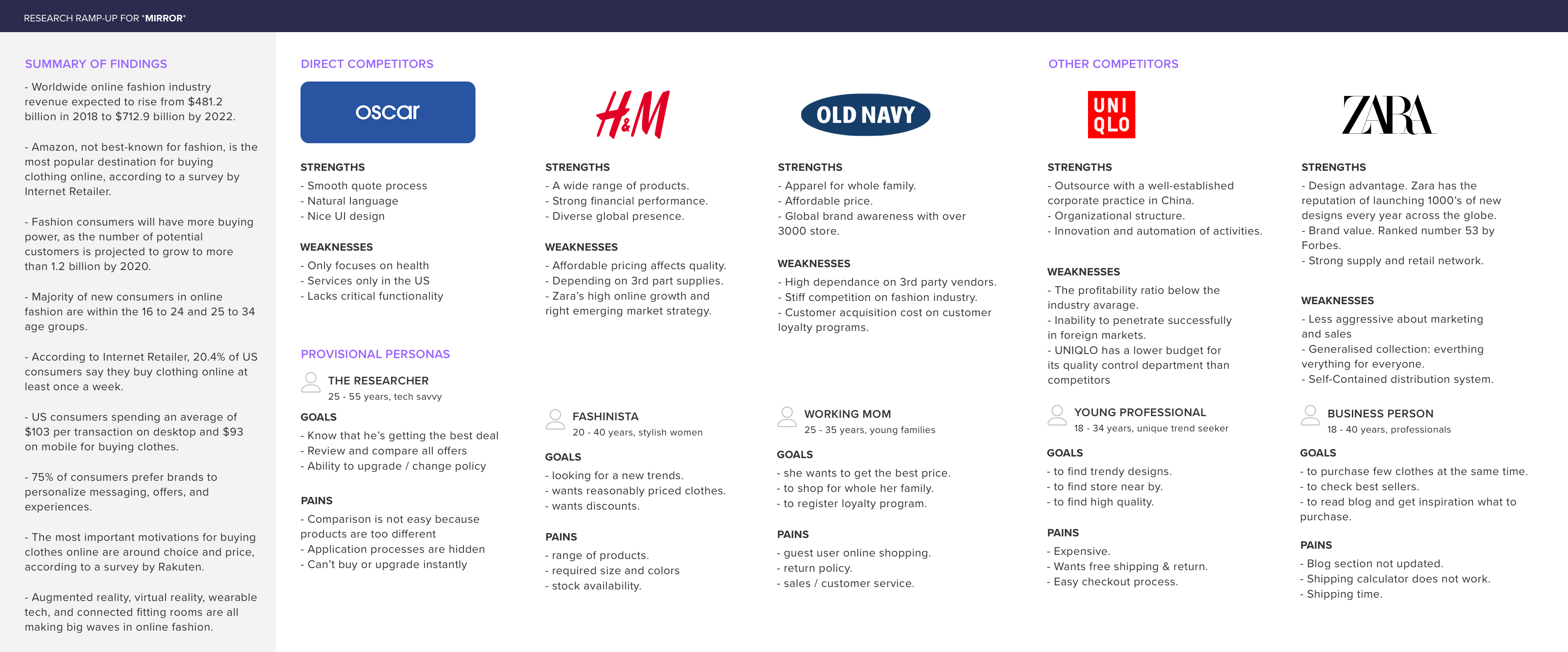
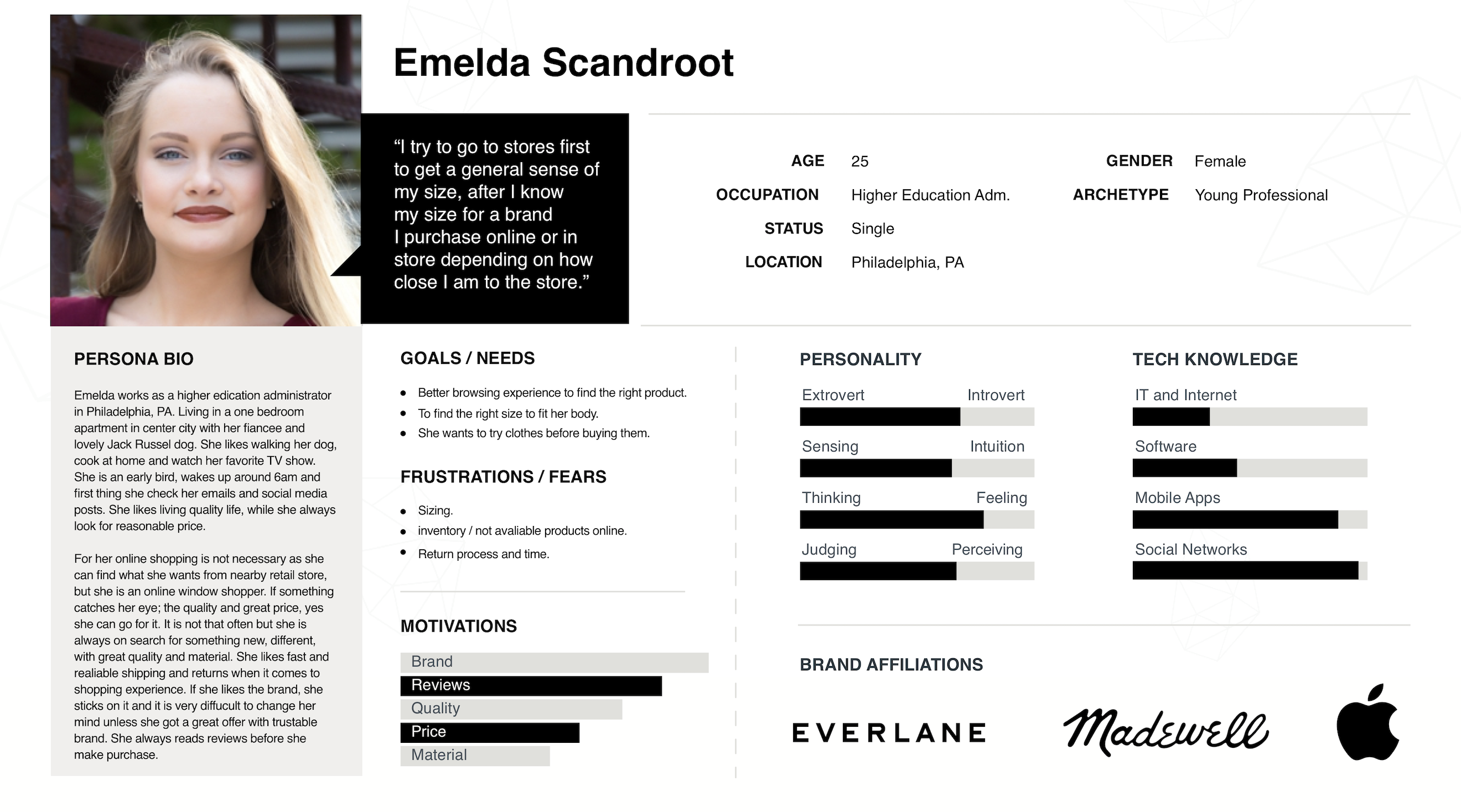
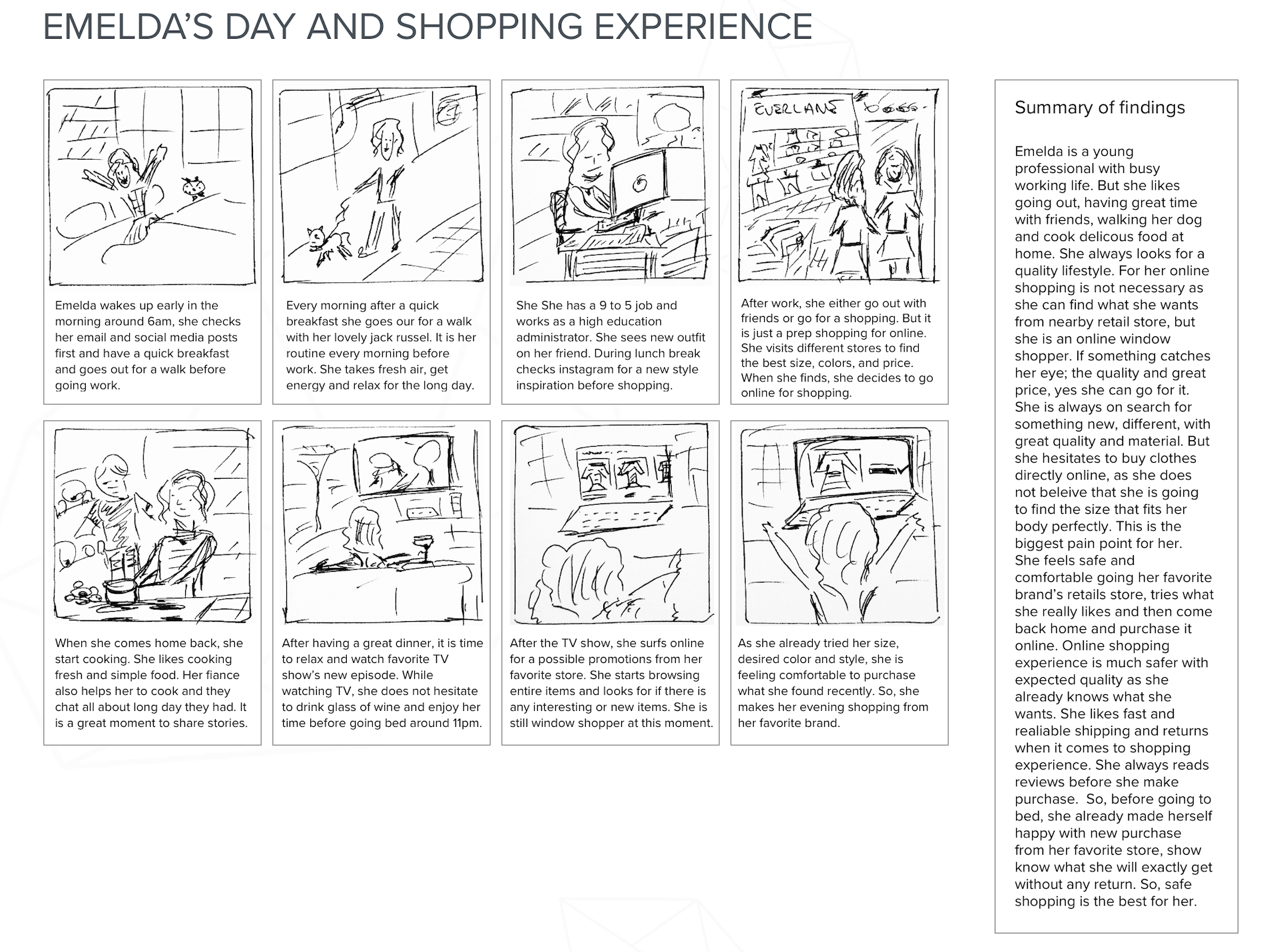
Market Research, Interview, Competitive Analysis, Personas Creation, Ideation, UI Design, UX Design, Style Guide, Branding, Usability Testing, Prototyping.

Tools:
Pen & Paper, Sketch, Invision, Photoshop

Sector:
Fashion

Prompt

Mirror has fallen behind in serving its customer base. Its customers expect the convenience and selection that come with online shopping, but are made to shop in physical storefronts with limited styles and sizes on-site when making a purchase from Mirror, pushing customers away towards digital clothing competitors.

Solution

Design an e-commerce website that serves customers digital access to Mirror’s entire selection of clothing styles and sizes.

01. Discovery

Scoope

The client approached me with the objective of designing an e-commerce website for their clothing business. Through conversations with the client, I was better able to fully understand the problem and its effects on the business.
  • Customers want to shop online.
  • An e-commerce model helps the client move inventory.
  • The current website does not meet customers needs.
  • Its important to the client to represent their brand well online.

Research

After understanding the problem, I was ready to conduct research to investigate a solution.

Research Goals

  • To determine the pain points of existing customers.
  • To identify what customers want in an online shopping experience.
  • To understand current trends and best practices in e-commerce.
  • To learn how to delight customers during online shopping.

Competitive Analysis

E-commerce is not a new business model. A big reason that customers put pressure on Mirror to digitize is because they can find clothing online from other brands, such as Old Navy, Uniqlo, and H&M. I conducted a competitive analysis to see what the other players are doing well and what Mirror could build upon.

02. Define

Customer Interviews

Understanding the landscape a little better, my next research initiative was to interview online clothing shoppers to hear about their experiences.
Sample:
I interviewed 9 people between the ages of 18 and 44. Mostly female. All interviewees had previously shopped for clothing online.

Key Findings

  • The participants want a better solution for sizing. 6 of 9 interviewees indicated that they have returned a clothing item purchased online because it didn’t fit.
  • The participants want to easily find clothing items matching their preferences.
  • The participants want to try on clothing items before purchasing them.
Having completed my research, I felt ready to plan out the rest of the project. This phase included defining a persona to design for and goals to guide project.

Persona

First I put together a persona that captured the characteristics of the user to design for. I created 3 deliverables to convey the persona— a persona overview, an empathy map, and a storyboard walking through a purchase by the persona.
I used Venn Diagram to map out the goals and requirements of the project. I later used this to help guide my decisions.

03. Ideation

Going into the design phase of the project I felt I had a good understanding of how to help the client and their customers. I used the key findings from the customer interviews to come up with a few difference-makers that would help Mirror’s site excel in serving shoppers.

Search

Because the interviewees had expressed frustration with being able to find the right items during previous online shopping experiences, I decided that search had to be a core component of the website. I made it big, placed it at the top of the page, and static as the user travels through the site. On focus, search comes completely into focus to isolate the search term and eliminate distractions.

Sizing

One of the initial reasons the client felt the need for a site was because customers could not find the right size in the store. Additionally the majority of the interviewees had a prior experience where they needed to return an item purchased online because it was the wrong size. Considering these points, I made sizing a prominent part of the item details page. I make it obvious which sizes are available by disabling and greying out unavailable sizes. Most importantly I added a link to learn more about Mirror sizing, so customers can be sure of sizing before the purchase.

Augmented Reality Try-On

A really exciting idea that came from the interviewees desire to try the clothing on before purchase was the concept of augmented reality “try-ons”.  With this concept a shopper can use their phone camera to see what the clothing item would look like on themselves to decide if they like the style.

04. Design

I then moved on to designing with Sketch & prototyping it with InVision. Actually prototyping it helped me to understand how some of the interactions designed in first place may not work well and helped me to iterate.

Information Architecture

Card Sorting1

Medium Fidelity Wireframes

High Fidelity Wireframes

Style Tile and UI Kit

05. Evaluation

Usability Testing

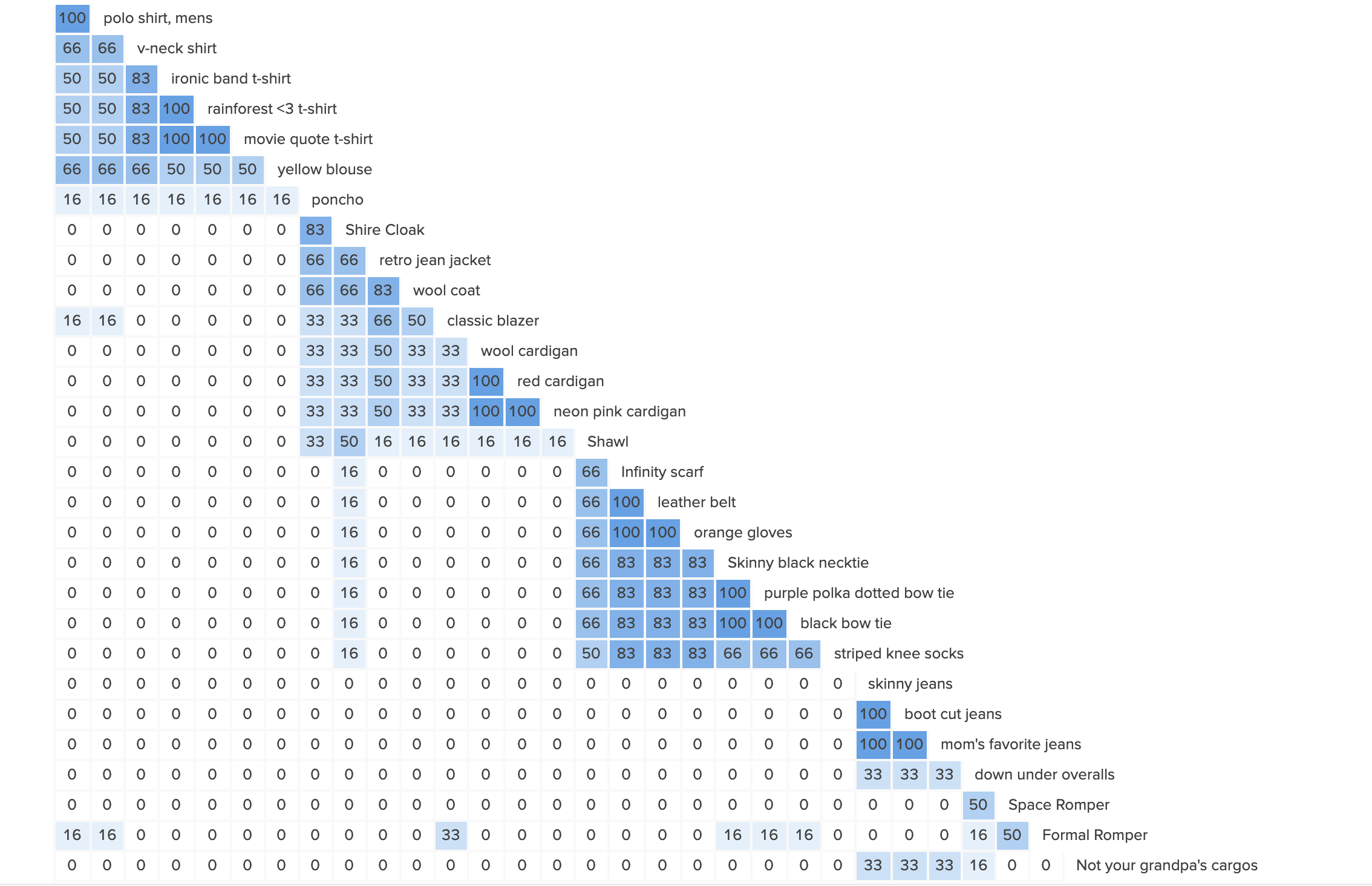
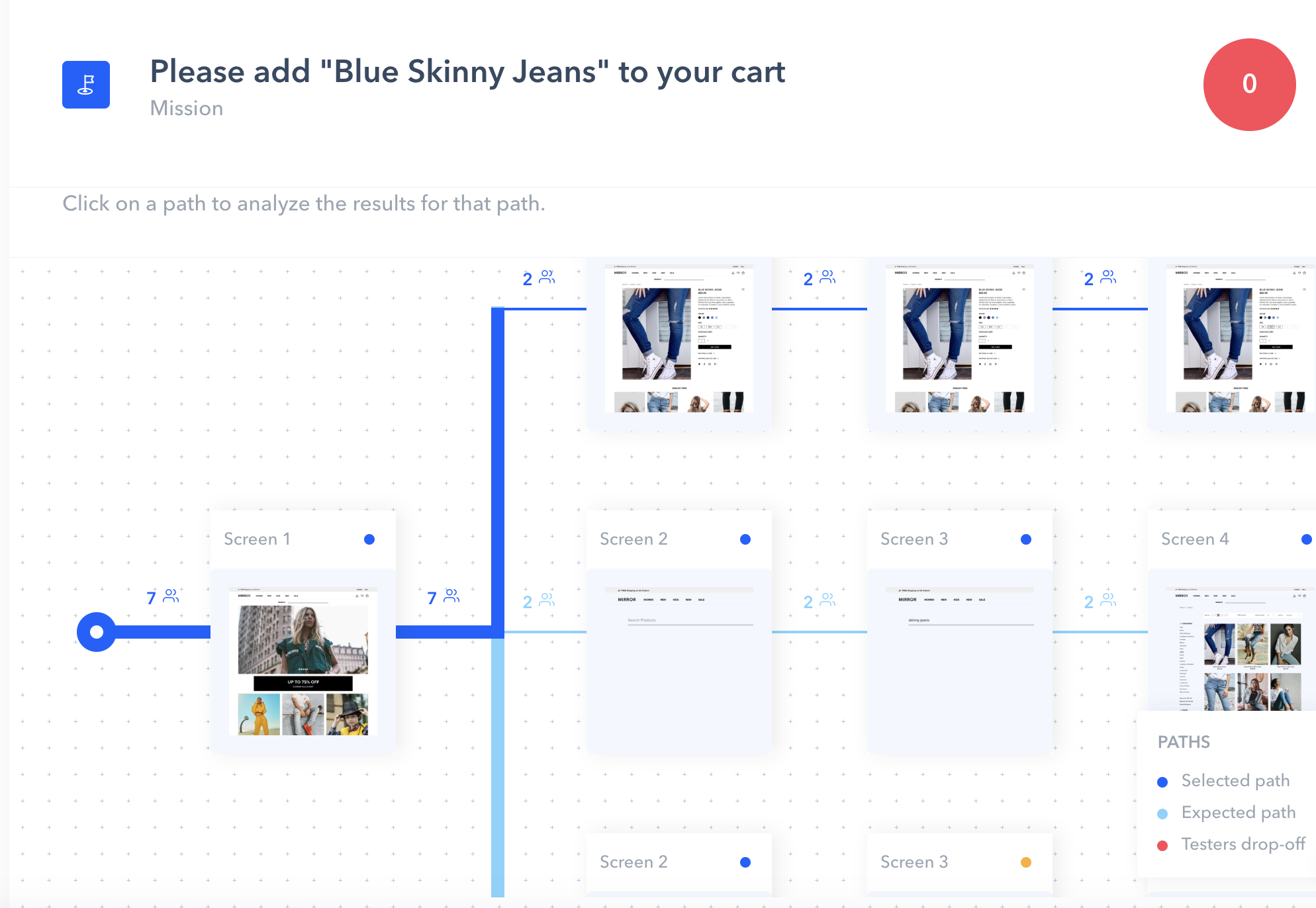
After the high fidelity design process, we conducted usability testing and created affinity diagram.

Test Objectives

  1. How easy to use the search function.
  2. Test the overall quality of the navigation and flow of the page designs.
  3. Test the successful task completion of adding item to cart.
  4. Identify how long it takes to complete finding specific product category in navigation.
  5. Get feedback about if there is any trust issue with the entire website design.
  6. Get feedback if there are any technical, or unusual issues, hesitation or confusion that users faced.

Test Subject
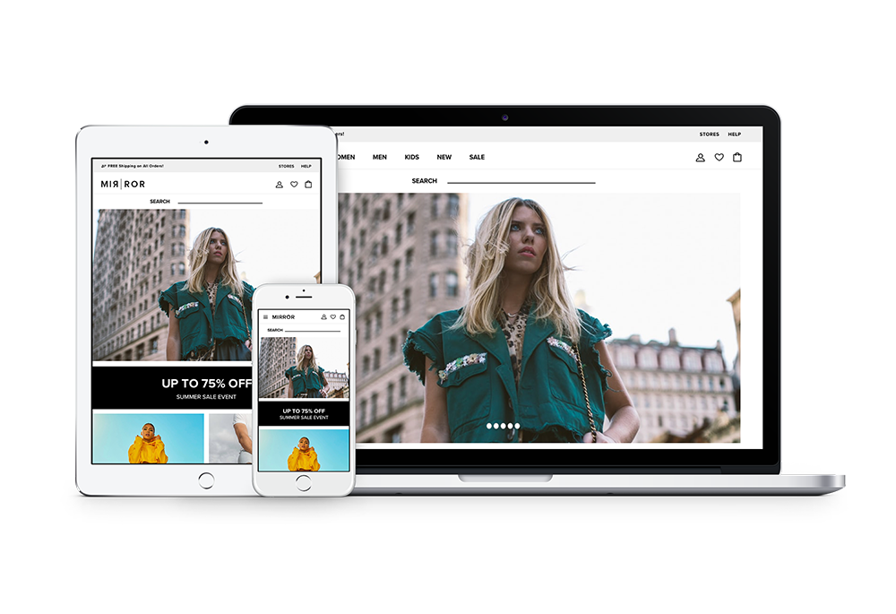
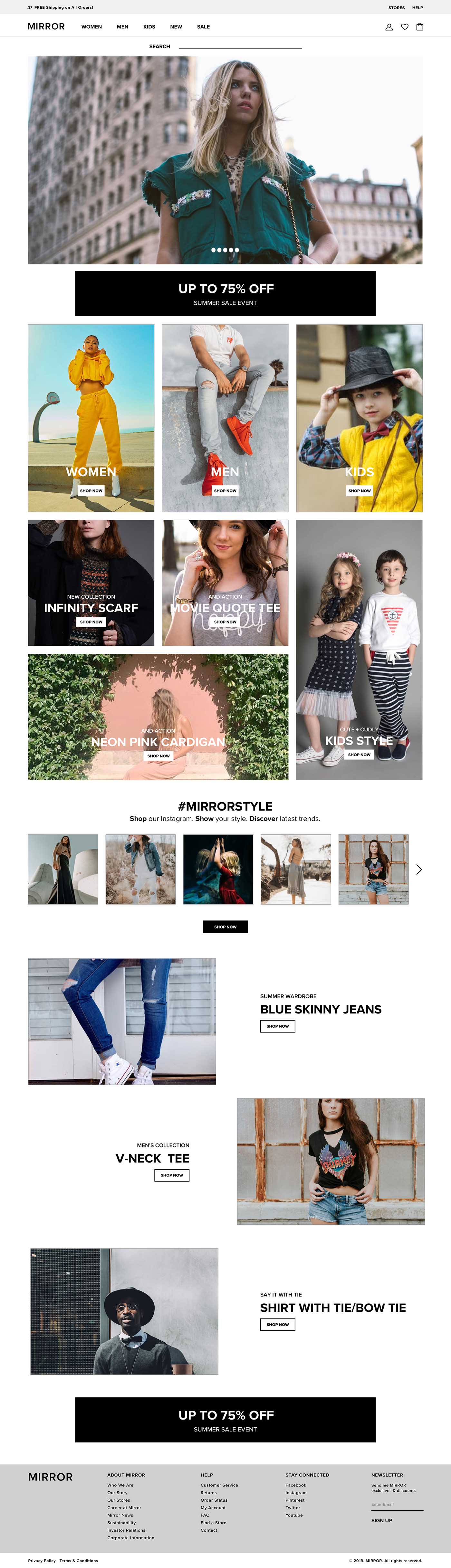
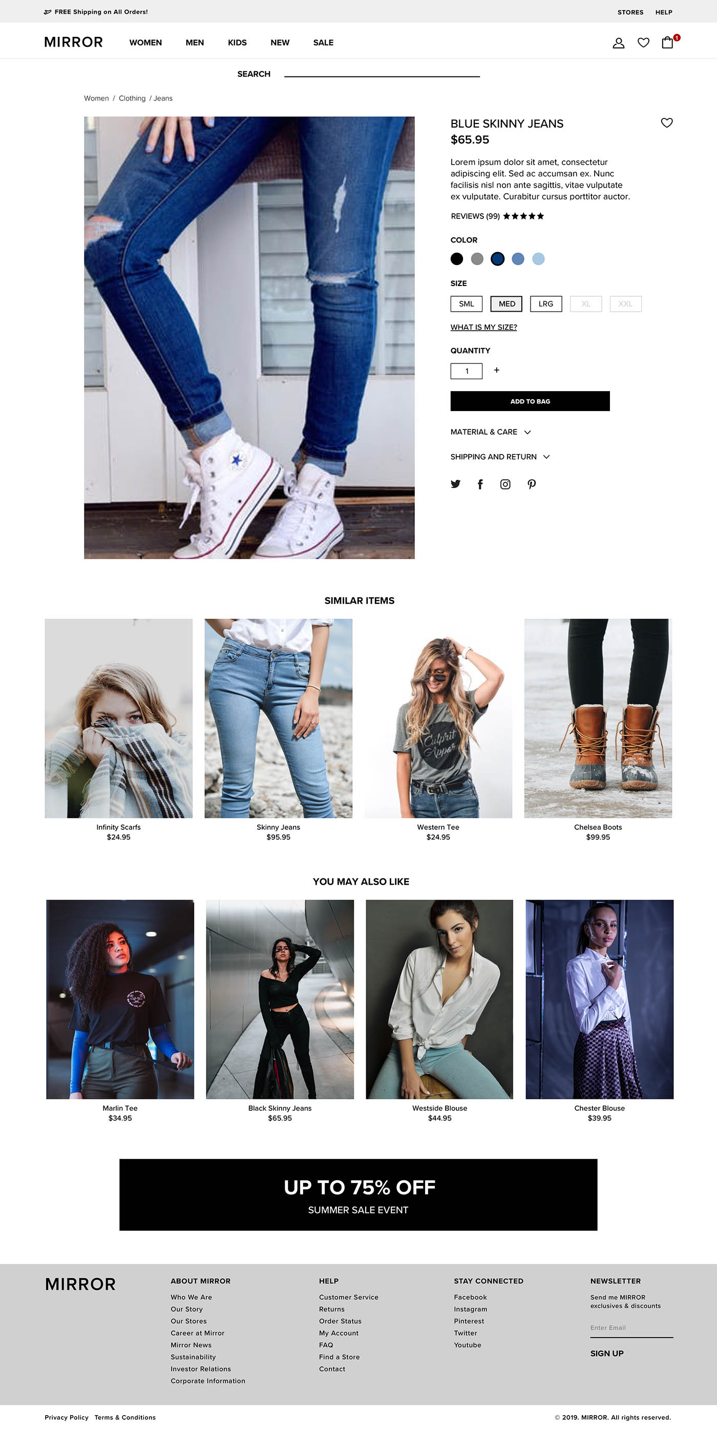
High Fidelity Prototype for Mirror Desktop Website

Methodology
Remote: I sent the link of Invision Prototype and ask comments and feedbacks.
In Person: I also used my laptop to share Invision Prototype with the participants.

Participants
Number of participants: 6-10
Age Demographics: 18 – 44
Personality: Have an interest in online shopping, and buying clothing online frequently.

Recruiting Plan
I recruited family friends, co-workers and friends of close friends to participate in this testing.

Please click here for Usability Report >>>

Usability Testing

Prototype

Please click here for Invision Prototype >>>

06. Reflection

Overall this was a really fun project to work on. I learned a lot about the problems that online shoppers encounter and enjoyed coming up with creative ways to solve them. Although Mirror is late to the game in going digital, they now have a strong design strategy to help them catch up.

Findings

  • Users had a difficulty clicking the Jeans category because of navigation over mouse effect.
  • Product search had a 75% success rate.
  • For finding specific item we had 100% success rate and, users spent on average only 3.7 seconds to find the item.
  • Adding product to cart was an another paint point for customers. 26.2% of users misclicked because of trying to choose another color or sizing option.

Feedback from the usability testing:

  • Search bar with autocomplete feature
  • Clickable navigation instead of over-mouse
  • All color and size options should be clickable
  • Overview page before checkout